Deposit and Withdraw Redesign
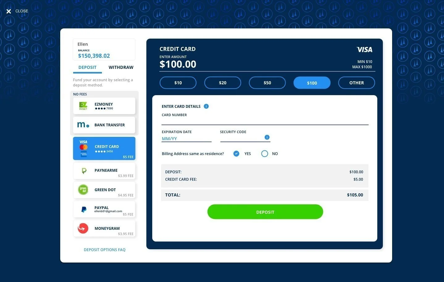
Final Design - [DESKTOP] Deposit
TIMELINE
August 2023
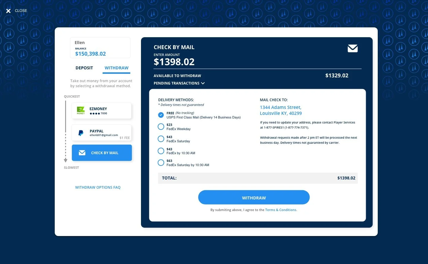
Final Design - [DESKTOP] Withdraw
MY ROLL
UX Designer at TwinSpires
Solo Project
SOFTWARE USED
Adobe XD
Excel
SUMMARY
This project focused on redesigning the Deposit and Withdraw pages across all TwinSpires platforms to enhance user experience and streamline financial transactions. By analyzing user feedback, competitor designs, and interaction data. I introduced a tabbed system for seamless navigation between deposit and withdrawal options, clarified fee structures, and highlighted transaction speeds to empower users with greater transparency and control over their financial actions.
BACKGROUND
TwinSpires is an online wagering platform owned by Churchill Downs. TwinSpires works primarily within the space of horse racing, offering a variety of formats within the sport to bet on. Users can deposit and withdraw money across TwinSpires’ desktop and mobile platforms.
PROBLEM
First time users struggle to fully understand what each deposit option is and which to choose.
Deposit transaction and withdraw fees are not clear or obvious to the user.
FAQs for deposit and withdraw are not easily accessible on the deposit and withdraw screens.
Deposit and Withdraw screens are not easily accessed in the same area on desktop.
SOLUTION
Make it easier for users to choose a deposit option and learn about each one.
Clearly display deposit and withdrawal fees so it is obvious to the user.
Add links to deposit and withdraw FAQs.
Make deposit and withdraw screens clickable on the same page.
QUANTITATIVE DATA
One of the goals for the redesign was to help new users pick a deposit method more easily because there are so many options. Some ways to help a user make a decision is to show users fees and descriptions of their options, both of which are not currently shown. In addition, I wanted to see what users currently use the most as that could be another way to help users pick a method - showing the most commonly used. To better understand what deposit and withdrawal methods TwinSpires’ users use, I asked Business Intelligence Analysts to pull some data. This data showed me what method types are most commonly used.
USER TESTING
Three users were tested to further understand problem areas within the deposit and withdrawal process. Testing showed that
None of the users noticed any fees
Users were confused about switching between deposit and withdrawal because they are on different pages.
Users didn’t know what each deposit option was and felt overwhelmed about which to choose.
FINAL DESIGNS
[DESKTOP] Deposit
[DESKTOP] Withdraw
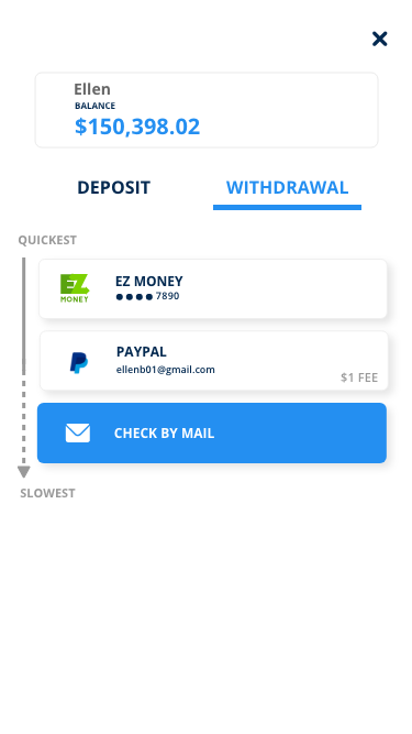
[RESPONSIVE] Withdraw
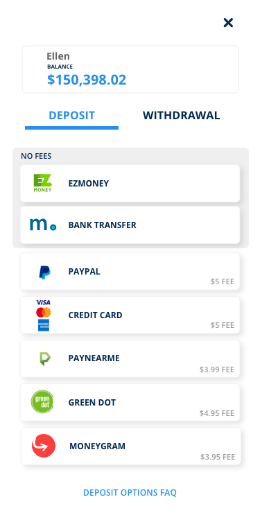
[RESPONSIVE] Deposit
[iOS/ANDROID] Deposit
[iOS/ANDROID] Withdraw


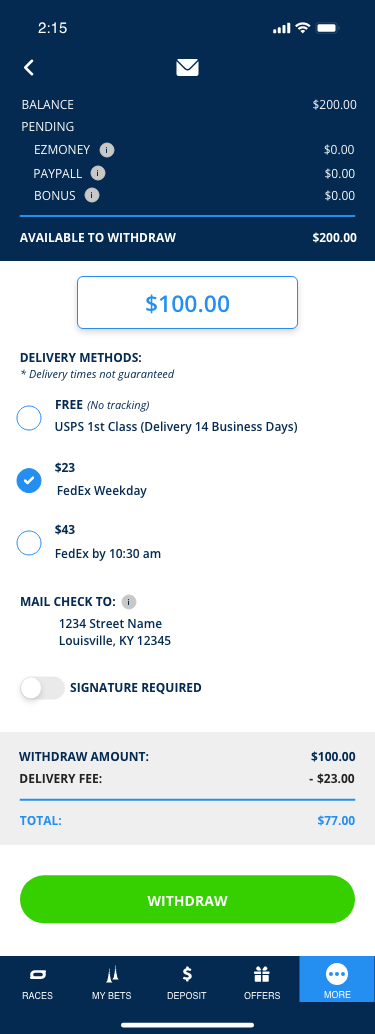
[iOS/ANDROID] Making Withdraw
Improvements made:
Deposit and Withdraw Screens:
Created a tabbed system so users can easily switch between deposit and withdraw on the same page.
Deposit Screen:
Show fees on deposit cards.
Added a light grey box to highlight the deposit options with no fees so it stands out to users on desktop and responsive.
Added a FAQs link below deposit cards on desktop and responsive.
Withdraw Screen:
Show fees on withdrawal cards.
Added a display to show users the fastest to slowest withdraw options.
Added a FAQs link below withdraw options.
On iOS/Android making withdrawals, I let users adjust the amount on the screen and made the deductions/total easier to notice.
LESSONS LEARNED
This project reminded me how important it is to advocate for the user. After being given this project, I took some time to ask questions in order to understand the full scope and goals of the project. I learned more about issues users were having and the negative feedback TwinSpires was repeatedly receiving about the deposit/withdrawal process. Some issues were about things like the slow withdrawal process while others were related to the UI. In particular, a major problem was that users felt lied to and confused when making deposits. There were fees that users did not notice and they’d contact customer support angry about more money than they thought they agreed to being taken out of their account. Some common pushback was making the fees too noticeable could disincentivize users. However, I was able to explain how it is more important to allow users to make informed decisions than to feel tricked by unclear fees. Meanwhile, we can highlight the options with no fees in eye-catching ways.