Decluttering LinkedIn Job Posts
TIMELINE
May 2024 - August 2024
MY ROLL
Solo UX Design Masters Degree Project
SOFTWARE USED
Figma
Google Sheets
OVERVIEW
In this project, I wanted to create a better experience for job seekers on LinkedIn. When starting this project, my first goal was to understand what problem areas I could find throughout the job-searching process. I started my research by doing a detailed competitive analysis of 3 direct and 3 indirect competitors. Next, I interviewed 6 individuals, who have used LinkedIn to search for jobs in the past 6 months, and listened to their experiences using the platform.
This showed me several pain points throughout the browsing and applying process like disorganized and incomplete job posts, security issues with personal information, fake job posts, poor job tracking, and more. After identifying these problem areas I came up with a list of potential solution options.
I then narrowed down all the problems I discovered into to a single issue to focus on. This ended up being the disorganization of information in job posts. I worked through opportunity exploration, sketching sessions, pattern research, user flows, low and high-fidelity wireframes, and finalized a prototype for testing. The goal of my prototype was to lower the cognitive load for the user and increase browsability.
9 usability tests were conducted on the prototype with the proposed design solutions. The usability test showed some great insight, so I was able to go back and iterate on the prototype to improve the user experience further. The testing showed success and users noted a great improvement in their experience browsing jobs on LinkedIn using my prototypes.
CLIENT OVERVIEW: LINKEDIN
Client Description: LinkedIn is the world's largest professional social networking site with more than 1 billion members in 200 countries. Originally founded in 2002, LinkedIn was launched in 2003 and acquired by Microsoft in 2016.
Product Description: LinkedIn has a website and app where users can create an account and network with others. There are three primary user bases: individuals, businesses, and recruiters. All users can create LinkedIn accounts and add information related to their purpose on the site. For example, individuals can add information about their career history and education, follow/connect with others, apply to jobs, make posts, and more. Meanwhile, businesses can list job openings, review applications, create posts, and more.
LinkedIn offers different plan options for accounts on their site. Accounts start at a basic, free version and can be upgraded by paying different price points for more features.
PRIMARY USER GROUPS
Project Focus:
Individuals
Searching for a job
Applying for jobs
Building a professional network
Other:
Businesses
Searching for job applicants
Posting business updates
Growing their customer base
Recruiters
Browse individual profiles
Outreach to potential applicants
This project focuses on improving the experience for individuals since I had the most access to this viewpoint.
PROBLEM STATEMENT EVOLUTION
Project Start:
How can individuals have a better job-searching experience?
Expanded (as project focused):
LinkedIn’s mission is to help job seekers achieve their career goals and quickly find jobs that match their needs, skill sets, and experience.
We have observed that customers are struggling with efficiently browsing due to lengthy and disorganized job posts which is causing them to grow frustrated and leave LinkedIn.
Our goal is to utilize AI to parse job posts and section everything in an accordion-style design so that our customers can easily browse job information important to them based on an increase in the number of applications submitted compared to job post views.
RESEARCH GOALS - PAIN POINT DISCOVERY
Learning Objectives:
Understand how users find jobs to apply to
Learn how users search, browse, and filter jobs
Identify features most often utilized in job searching
Understand pain points in the job search and application process
Research Description:
Competitive Analysis
Analyze 3 direct and 3 indirect competitors
User Interviews
Research Approach - 30 minute interviews
Research Participants - 6 individuals who have recently searched for jobs on LinkedIn
Timing - interviews were conducted May 28 through June 5, 2024
COMPETITIVE ANALYSIS
3 Direct Competitors:
Glassdoor
Indeed
Otta
3 Indirect Competitors:
Facebook
Instagram
Github
Google Sheets: View Full Competitive Analysis
Go to the link above for the detailed analysis where I dive deeply into each of the direct and indirect competitors. For a quick overview of the three direct competitors - each of these job boards have a variety of useful filtering options. However, each site had noteworthy points in its unique offerings.
Glassdoor is a popular job board, with 44.1 million monthly users. Glassdoor’s competitive advantage is seen in two capacities:
Users can post anonymous reviews about companies from past and current employers on workplace experiences, company culture, work/life balance, management, salary, and more.
Aggregates and displays detailed salary information based on past/current employee responses.
Indeed is another large job board, with 572.4 Million monthly users. Indeed offers unique features like:
A custom resume builder
Company Reviews - similar to Glassdoor - however, I’d like to note that there were many complaints about false reviews on both platforms.
Otta is a newer job board that started in 2019 and quickly growing with 4.7 Million current monthly users. Otta’s competitive advantage is:
A highly selective certification process for companies to post jobs on their site. In order to fight against fake/scam job postings.
Fully personalized jobs, only showing jobs based on user input for experience, skills, etc.
Detailed company information with information like recent news stories, latest layoffs, and much more.
Each of these companies offered unique features that LinkedIn does not offer. It seemed that the highest praise come from the certification process and detailed company information.
USER INTERVIEWS: PARTICIPANT OVERVIEW
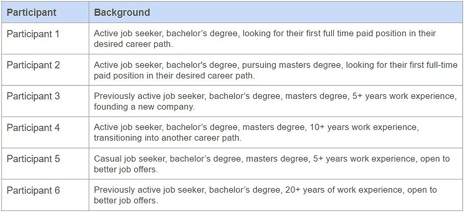
The 6 individuals I interviewed were in different stages of their career with varied years of experience and degree levels. Some were actively, casually, or not at all looking for a job right now. However, everyone had utilized LinkedIn in their job search within the last 6 months.
USER INTERVIEWS: PARTICIPANT KEY FINDINGS
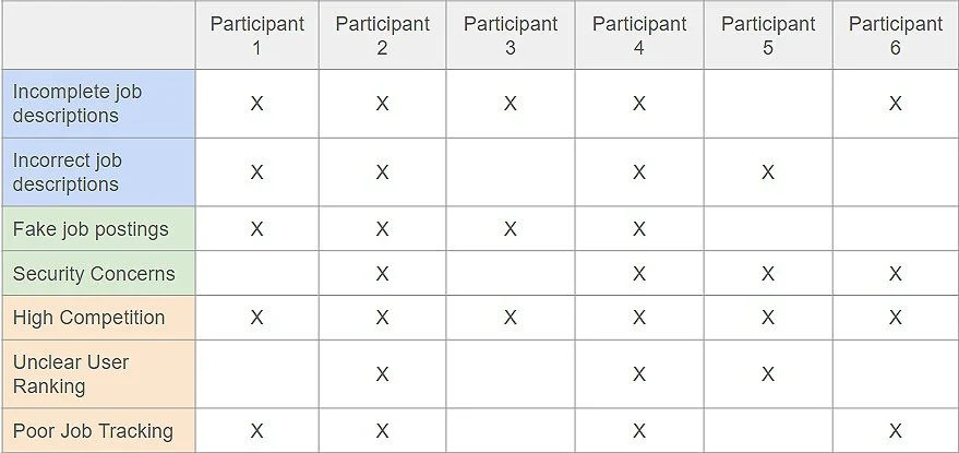
Here you can see my participants with the key findings I discovered from the interviews. One issue was described by every interviewee was where users noted the issue of how highly competitive LinkedIn felt.
USER PERSONA

From all of this information, I created this persona of a woman named Rachel. Rachel has a solidified career, but her family’s expenses have recently increased due to some medical bills. Rachel is now looking for a job to help cover these expenses so she is eager to find a new job with a higher salary as quickly as possible and starts her journey on LinkedIn. Her goals are simple: to browse, apply, and get a job. And her pain points encompass the same problem areas of my 6 interviewees.
USER INTERVIEWS: KEY FINDINGS & INSIGHTS
My research led me to multiple key findings that were expressed by my interviewees. Users noted the following issues which are color coded to match the insights they relate to:
Findings:
Inadequate Job Descriptions
Incorrect Information
Fake/Scam Job Postings
Security Concerns
High Competition
Unclear User Ranking
Poor Job Tracking
Insights:
Insight 1: Improving the quality and completion of information in job posts will improve user satisfaction and retention.
Insight 2: Enhancing the validity of companies able to post jobs and therefore the security of user information will improve user trust.
Insight 3: Clarifying the job hunt process and how applicants compare can improve understanding and trust.
INSIGHT 1: Improving the quality and completion of information in job posts will improve user satisfaction and retention.
The quality and completeness of job descriptions has a noticeable impact on the satisfaction and retention of users. With incomplete and incorrect job descriptions, users often found themselves leaving LinkedIn to visit competitor sites and company sites to find more information.
Key Findings:
Inadequate Job Descriptions - Many users noted an issue with job posts lacking all of the relevant information. Some posts were missing key job tasks, location, pay, and more. Additionally, users wanted more relevant job and company information across posts.
Incorrect Information - Issues with incorrect information in the job descriptions were noted. Often, these issues were found with location information and pay.
INSIGHT 2: Enhancing the validity of companies able to post jobs and therefore the security of user information will improve user trust.
Security for users personal information is critical in shaping users trust in LinkedIn. Users noted feeling uneasy to use the “Easy Apply” feature as they felt those jobs were most often used for fake jobs and where their personal information was stolen. Additionally, the security concerns led users to prioritize other job boards/networking sites over LinkedIn.
Key Findings:
Fake Job Postings - Users reported issues in dealing with fake/scam job postings and messages. These fake job posts can lead to information, time, and monetary loss for LinkedIn users if not identified in time by the users.
Security Concerns - Many users have concerns with the security of their personal information. Multiple users reported real and fake job posts where their personal information was stolen.
INSIGHT 3: Clarifying the job hunting process and how applicants compare can improve understanding and perseverance.
Many users expressed frustration, confusion, and discouragement through their job hunting process on LinkedIn from a lack of clarity. The highly competitive market leads to many applicants and many job posts, but unclear rankings and application records mean users are left confused when they repeatedly get auto rejected and ghosted from jobs they qualify for. Frustration also arises from having to utilize multiple sites to track jobs and the current job tracking system on LinkedIn is incomplete and uneditable.
Key Findings:
High Competition - The high competition and saturation of job seekers on the site was noted by all users interviewed. Users noted that seeing how many applications were submitted for one job post was disheartening to see and deterred them from submitting their own application.
Unclear User Ranking - Users wondered how they ranked against their competition with a tough job market. Users would begin to feel discouraged and look for ways to improve their profile when they noticed they’d get auto rejections from jobs they qualified for and wondered what they may be doing wrong.
Poor Job Tracking - Multiple reports of incomplete job tracking in Linkedin were identified. Job posts would not be saved so were unviewable if the posters deleted their posts. Additionally, job applications that were submitted through LinkedIn were Users especially disliked how everything was entirely uneditable to update job rejections or interview stages.
RECOMMENDATIONS
Based on the varied problem areas, I determined there are numerous solutions are available:
Job posts will have distinct sections for job posters to fill out
Better for browsing because all job posts will have the same order of information
Helps in job post completion because you can make some sections required in order to post a job
Better certification/validation of companies/job posters
Minimize fake jobs postings
Increase security of users personal information
Can be like the feature they offer users where they can submit their ID and verify they are a real person and who they say they are. There can be a similar verification process for companies.
Updated Applicant Numbers
Update job applicant number on a job post to show current applicants being considered
Help users not feel so disheartened at the high “applicant” number despite it just showing clicks on a job and not even actually applicants
Descriptions/educational insights about individual rankings
Lower user frustration in their understanding of what information to fill out and how on their profiles
Now that the base research is completed, it’s time to refine our focus and dive into one solution.
FOCUSING THE PROJECT
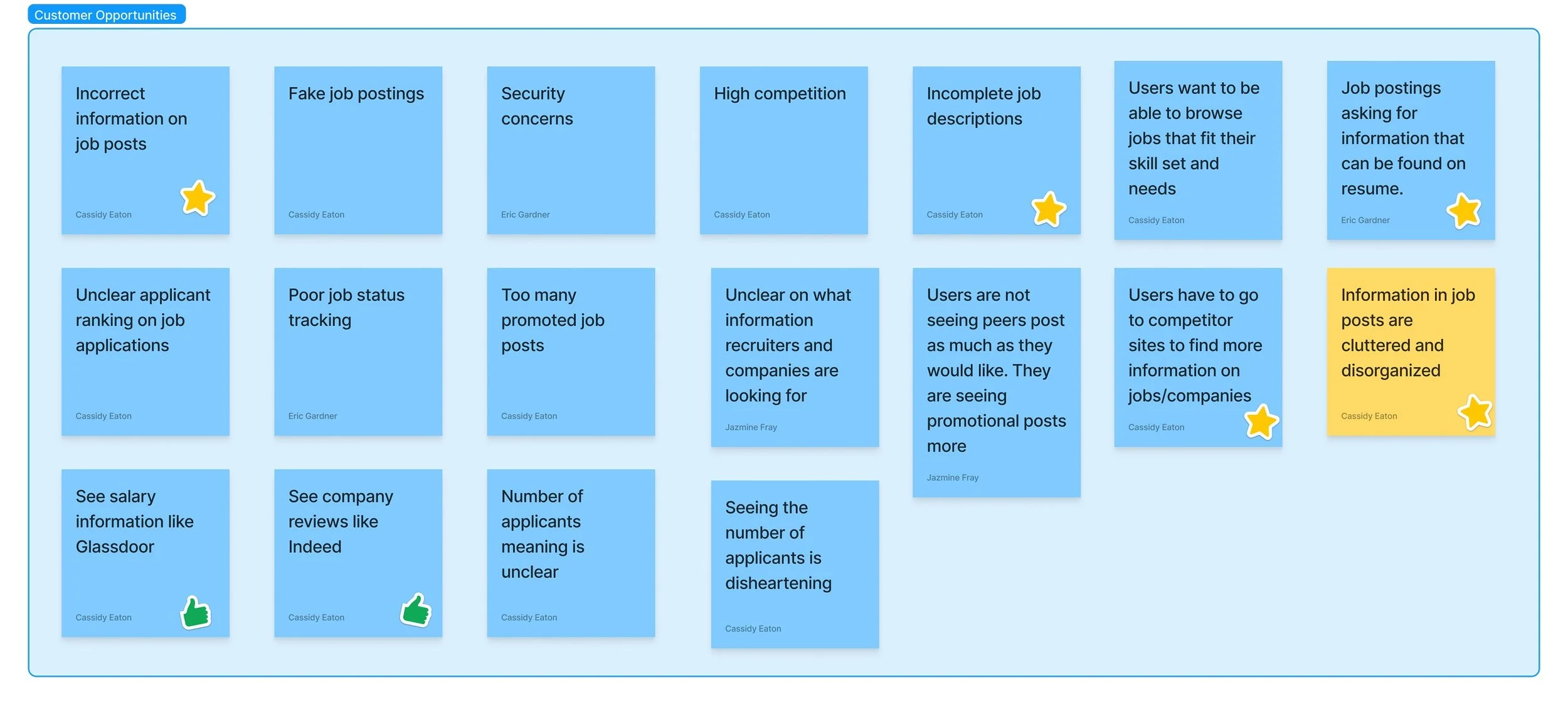
Looking at individuals using LinkedIn to search for jobs, research showed issues in areas like fake job postings, high competition, poor job tracking, and more. While there are multiple potential avenues for improvement, I wanted to spend my time on solving one problem these users face. I decided to find my focus within the issues presented about job posts (starred above).
OPPORTUNITY/SOLUTION TREE
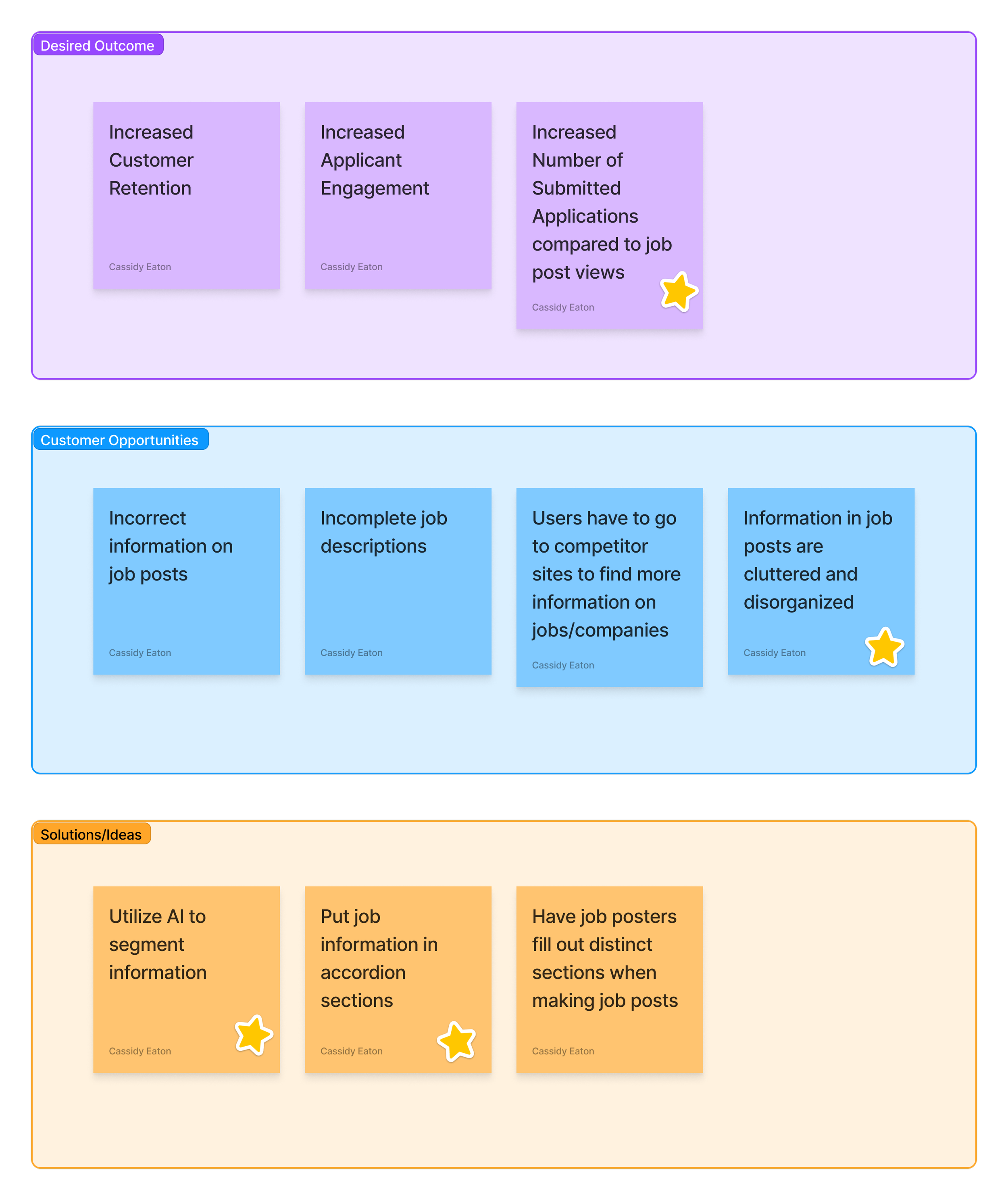
There were numerous complaints about job posts and I decided to focus in on one issue in particular - the disorganized and cluttered job information.
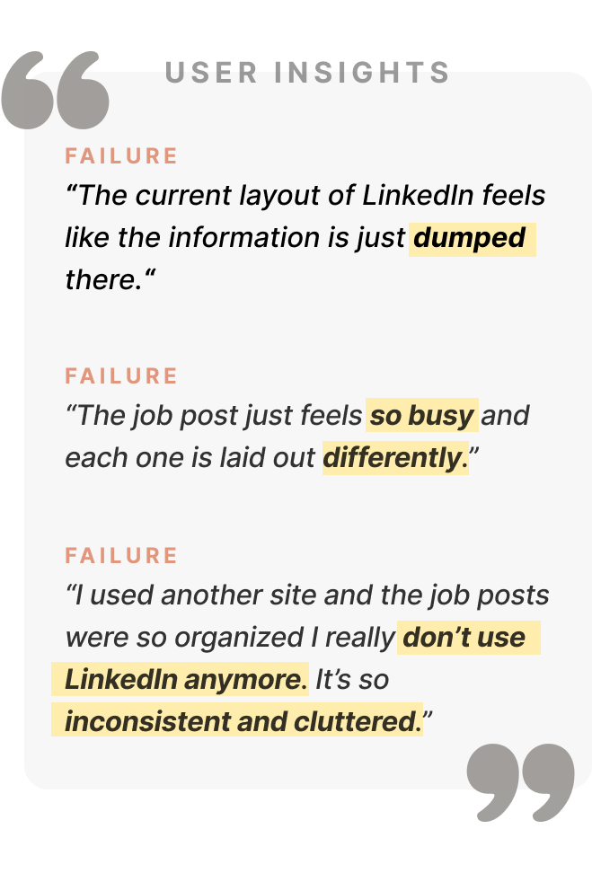
Using words like “endless scrolling”, “irrelevant”, “cluttered”, and “busy” - users had lots of complaints about job posts on LinkedIn. Users struggled to quickly browse posts because there is no consistency from post to post and lots of information to look through.
I created a Solution/Opportunity Tree to understand the KPIs I’d be considering and potential solutions.
LinkedIn’s Desired Outcome: Increased customer retention identified by an increase in the number of applications submitted compared to job post views.
Customer Opportunity: Information in job posts is cluttered and disorganized.
Solutions/Ideas: Utilize AI to segment information and accordion sections to reduce cognitive load and improve browsability.
With this diagram, I was able to finalize my project focus. This led me to my new upgraded problem statement.
Additional Considerations:
While many users noted disorganization and a want for features found on other sites like Glassdoor’s salary information or Indeed’s company reviews. I realized I did not know the legality of adding similar features to LinkedIn’s site, nor any agreements LinkedIn may have with these competitor companies, so I decided to focus our efforts on the complaints of disorganization.
One of my first thoughts was to add sections for the job poster (businesses/recruiters) to fill out. This would help with sectioning and consistency. However, my professor did not want me to impact the job poster experience while working to improve the job seekers’ experience.
PROBLEM STATEMENT (UPGRADED)
LinkedIn’s mission is to help job seekers achieve their career goals and quickly find jobs that match their needs, skill sets, and experience.
We have observed that customers are struggling with efficiently browsing due to lengthy and disorganized job posts which is causing them to grow frustrated and leave LinkedIn.
Our goal is to utilize AI to parse job posts and section everything in an accordion style design so that our customers can easily browse job information important to them based on an increase in the number of applications submitted compared to job post views.
USER FLOW
I mapped out my potential solution in the current user flow. Focusing on the job posts mean there won’t be much change in the current flow of the user.
COGNITIVE LOAD
The pairing of AI and accordion dropdowns is really helpful in solving the issues noted by users with the current layout of job posts on LinkedIn.
Utilizing AI to parse job posts allows for the experience to remain unchanged for people posting jobs, while allowing the creation of defined sections where information can be sorted into. Machine learning has advanced enough to make this method pretty reliable and accurate.
The accordion component allows us to deliver large amounts of information in a small space through progressive disclosure. The header title gives the user a high-level overview of the content allowing the user to decide which sections to read.
Together this will decrease cognitive load by presenting less information to users at once and increasing browsability as users can see exactly what they are interested in.
EXPLORING DESIGN PATTERNS
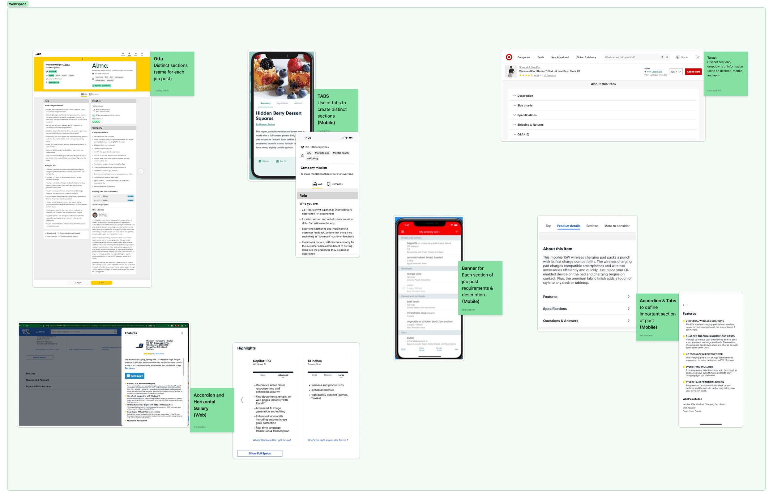
I started by browsing sites that utilize distinct sections in various ways to gather design ideas and see how accordions sections could best be utilized.
One good application of accordions is found on Target’s site. Target utilizes accordions to section various information for their products.
SKETCHING
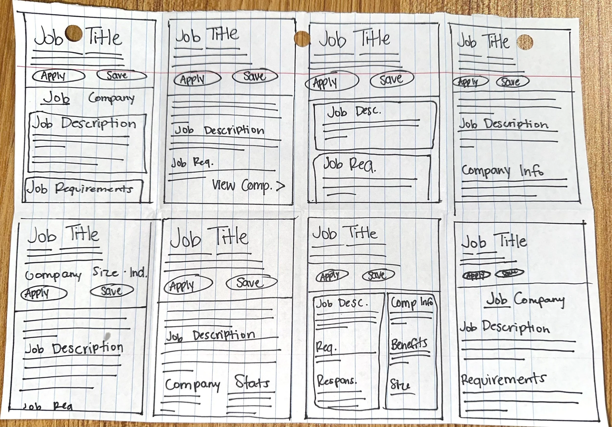
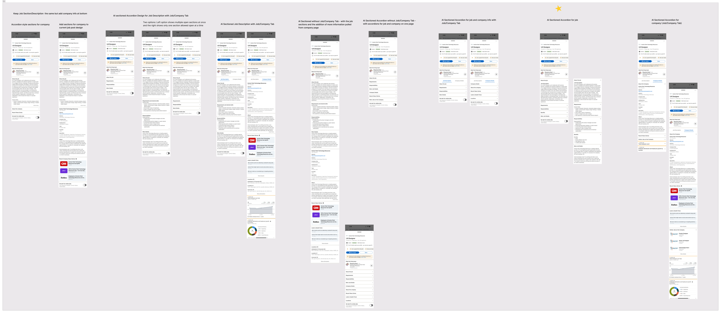
My first step was to conduct a timed sketching session called Crazy 8’s where you get eight minutes (one minute per frame) to sketch eight frames. I had some initial ideas of adding company information.
Next, I took some of my favorite ideas and made prototypes to get a clearer understanding of the design.
The design with the star above it is the design I decided to move forward with.
Additional Considerations:
Some of the screens above show a tabbed system with company information. One of the complaints found in the interviews with users was that they had to go to multiple other pages and sites to view company information. I thought it could be useful to include company information in the job post somehow. This led me to trying out two main design methods for this - adding the information to the bottom of the job post or having a tab specifically for it in the job post. This information would be pulled directly from the company pages on LinkedIn as there is already helpful information found here.
Additionally, I considered how AI could be utilized to browse the internet for recent news stories related to the company. This could show job seekers information like recent layoffs.
PROTOTYPE - VERSION 1
Current Design
Updated Prototype
Above, you can see the current layout of job posts on the left and my prototype with the new design on the right.
The top section header is the same. On the left image, you can see all the job information is in one large section. There is no consistency between job posts so all the information can be in any order and format.
On the right side, my prototype tackled this problem with AI and accordions. Below we will dive into the prototype.
Prototype Overview:
The accordion sections I defined are common sections found in a job post.
The image on the left displays the initial view and the right image shows the content in each section.
The first accordion section, labeled “About the job”, automatically opens when the user clicks the job post. Only one accordion section is open at a time. When a user clicks another section, the previous section automatically closes. This is done to minimize the cognitive load by presenting users with less information at a time.
If clear sections are not defined by the job poster, or information is difficult to parse, then the information will default to the “About the job” section.
Any sections missing information will not be included in the job post for the user.
Other sections (like premium) will still be visible at the bottom of the job post as it currently is.
Prototype Functionality Notes (Mobile iOS App):
Only one accordion section is open at a time. When a user clicks another section to open the previous section automatically closes.
The first accordion section “About the job” automatically opens when the user clicks the job post.
AI parses the job submitted by job posters to segment information accordingly into accordion sections.
If clear sections are not defined, or information is difficult to parse, then the information will be defaulted to the “About the job” section. Other accordion sections will not be filled, and thus not shown to the user.
If information is missing for the other sections, the accordion sections will not be included in the job post.
Other sections (like premium sections) will still be visible the same at the bottom of the job post as it currently is.
USABILITY TESTING
Now it was time for usability testing on my Figma prototype. I wanted to know how users felt about this new type of organization and the usage of accordions.
Learning Objectives:
How do users feel about this organization of information
How do users feel about the usage of accordions?
Thoughts on the overall feel of the new layout of information.
Is our solution minimizing cognitive load for our users?
Is it discoverable and intuitive?
Do these changes make job posts more easily browsable?
Research Description:
Usability Testing:
Research Approach - 35 minute 1:1 interviews
Research Participants - 9 individuals who have recently searched for jobs on LinkedIn
Timing - interviews were conducted August 6 through August 10, 2024
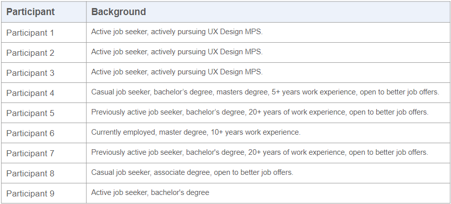
PARTICIPANTS - USABILITY TESTING
All of the participants for this usability testing were in different stages of their career. However, everyone had utilized LinkedIn in their job search within the last 6 months.
RESULTS - USABILITY TESTING
The usability testing uncovered multiple findings:
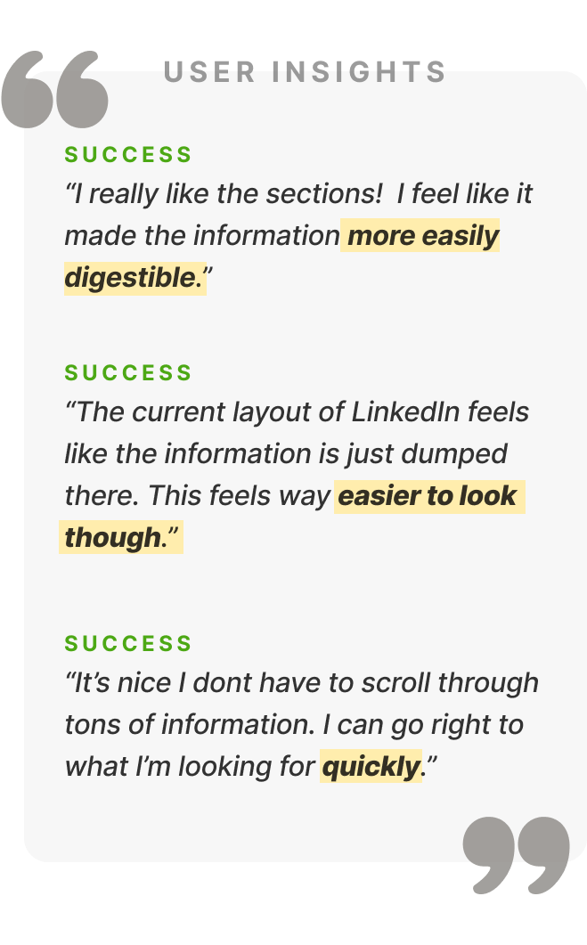
Users appreciated the new sectioning and accordion drop-downs. They noted how the job posts were easier to browse because they could find the information that they were most interested in much faster.
Users wanted to open multiple accordion sections and browse that information rather than be limited to one section at a time.
Users tended to group the information in the “Requirement” & “Responsibility” and “Salary” & “Benefit” sections together.
The “Requirement” & “Responsibility” and “Salary” & “Benefit” sections were the only sections users looked at before making a decision to apply to a job or not.
Users viewed job post information in a similar order each time: with “Requirement”, “Responsibility” and “Salary” viewed at the beginning and then “Benefit” information.
Users did not view the job descriptions. When prompted why, many users noted or realized they rarely ever read it.
UPDATED PROTOTYPE
I made three main updates to this new prototype to reflect the findings of the usability test. I wanted to:
Allow multiple accordion sections to open at a time
Redefine the content of each section
Reorder the accordion sections
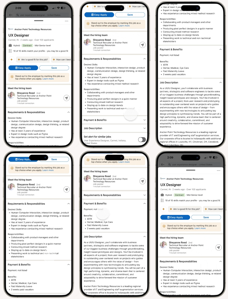
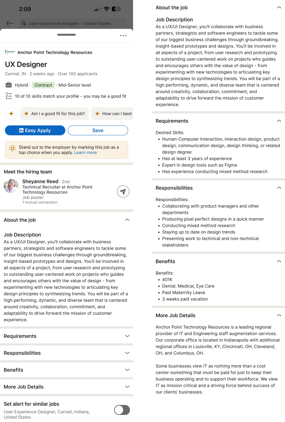
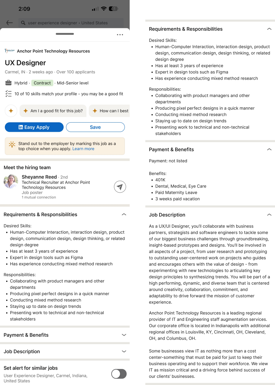
Prototype (Version 1)
Updated Prototype (Version 2)
Updated Prototype (Version 2)
Allowing Multiple Accordion Sections Open
The updated prototype allows users to open multiple sections at once.
Redefined Accordion Sections
Additionally, since I found users grouping information together, we combined “Requirements” & “Responsibilities” into a section together and “Benefits” & “Salary” into another section.
I also got rid of unnecessary sections like the extra section to hold nonspecific information as it caused confusion. Now the job description and any nonspecific information will be consolidated in one “Job Description” section.
This compression from 5 tabs in our original prototype to 3 tabs will help the initial cognitive load even more, reduce clicks, and group sections of related information.
Adjusting Accordion Section Order
Lastly, since I noticed users only looked at specific job information when determining whether they’d apply or not, I wanted to reconsider how we were ordering our accordion tabs. Based on the usability testing, the order the information was viewed was nearly the same across all our participants.
So instead of following the typical layout order of a job post, I decided to reorder the information in the order of most viewed. So the accordion order was adjusted to “Requirements & Responsibilities", “Payment & Benefits”, and then “Job Description”.
Updated Functionality Notes (Mobile iOS App):
Any number of accordion sections can be opened at a time.
The first accordion section “Requirements & Responsibilities” automatically opens when the user clicks the job post.
AI parses the job submitted by job posters to segment information accordingly into accordion sections.
If clear sections are not defined, or information is difficult to parse, then the information will be defaulted to the “Job Description” section. Other accordion sections will not be filled, and thus not shown to the user.
If information is missing for the other sections, the accordion sections will not be included in the job post.
Other sections (like premium sections) will still be visible the same at the bottom of the job post as it currently is but in accordion sections.
FINAL THOUGHTS
According to this initial testing, my proposed solution to utilize AI parsing and accordions in job posts successfully improves browsability for job seekers looking at job posts. The utilization of AI to parse job information and organize it into accordion sections allows for a lower cognitive load and better progressive disclosure than the current experience on LinkedIn. Users declared having a more efficient and enjoyable experience with my proposed layout.
For the next steps, I would like to do another round of testing and study the layout and content of more job posts in a variety of industries to see if any additional sections should be added. Also, getting a deeper understanding of how users are grouping job post information would be beneficial to research more. I would love to work more with development in the utilization of AI to parse job posts and test for accuracy. Once the additional research concludes, some iterations to the design would need to be made before the official handoff to development. Eventually, I would recommend running A/B testing on some users with the new layout and see how the number of applicants per viewer compares to the original version.
